User talk:Goetzkluge
From The Art and Popular Culture Encyclopedia
Pleased to meet you and thanks for your edits. --Jahsonic 15:00, 27 February 2010 (GMT)
- It's a pleasure to use your Wiki. --Goetzkluge 15:02, 27 February 2010 (GMT)
[edit]
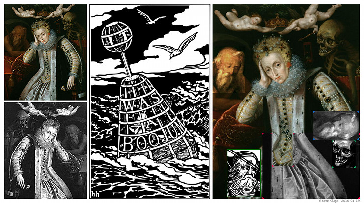
Bellman-Ditchley comparison

- You are right: This is one of the weaker comparisons. But think, that there are several (albeit modified) graphical quotes. Examples (there are more clues than these three ones): (1) You may try to match the ropes on the right side (Holiday) with the lined up pearls on the clothing of the queen on the right (Gheeraerts). (2) The rather boyish waist of the Bellman and the waist of the queen. (3) The overall composition of both images.
- DitchleySnark1000.jpg has a higher resolution.
- This picture helped me to find a match for the rear cover:
- Cover.cgi and
- Boojum_lg.jpg
- "Father Time" in that English School painting of Elizabeth I is very likely to be the source for the Bellman's face on the front cover again:
- FatherTime.htm
- As in all cases, there won't be any 100% proof. If you do not feel comfortable with the Bellman-Ditchley comparison, I won't mind if you remove it. I won't "snark" your wiki ;-)
- What do you think about the other pictures? If you are registered with Amazon.com, then you can see in http://lc.snrk.de/, how the ranking ("like"/"don't like") of the "safer" comparisons looks like. However, until now there are only votes from 6 participants.
- --Goetzkluge 22:58, 28 March 2010 (GMT)
- I'm parking the image here for the time being. I love the Ditchley Portrait! --Jahsonic 13:43, 29 March 2010 (GMT)
- I like it too. --Goetzkluge 19:33, 29 March 2010 (GMT)
- I'm parking the image here for the time being. I love the Ditchley Portrait! --Jahsonic 13:43, 29 March 2010 (GMT)
